Grayson Lewis Professional Services
graysonlewis.co.ukProject Services
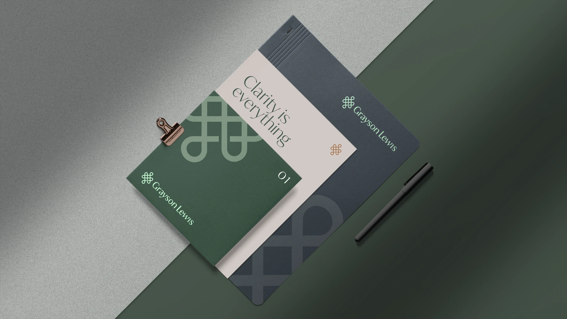
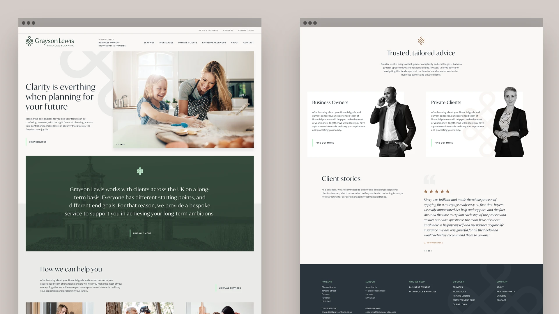
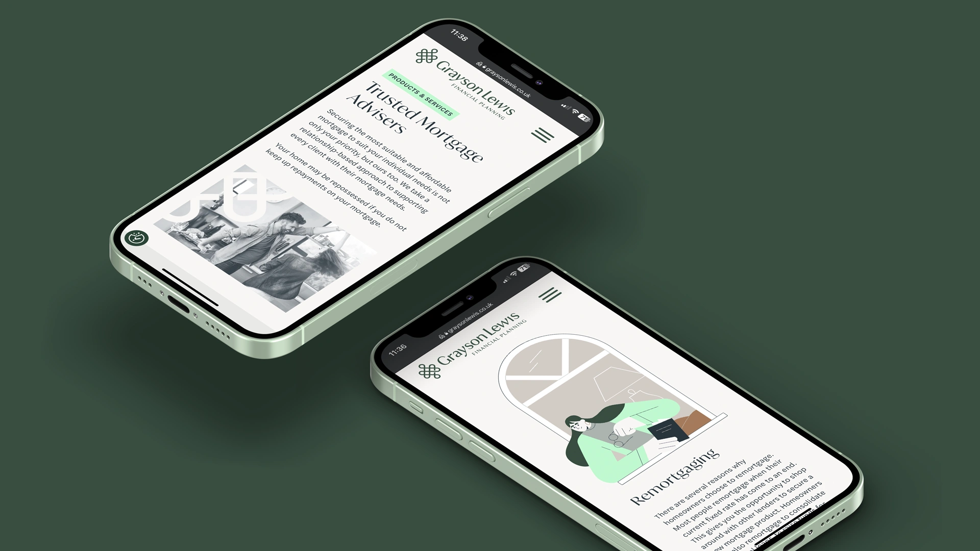
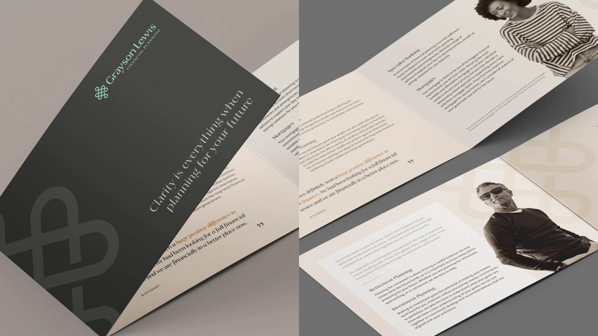
Clarity is everything.
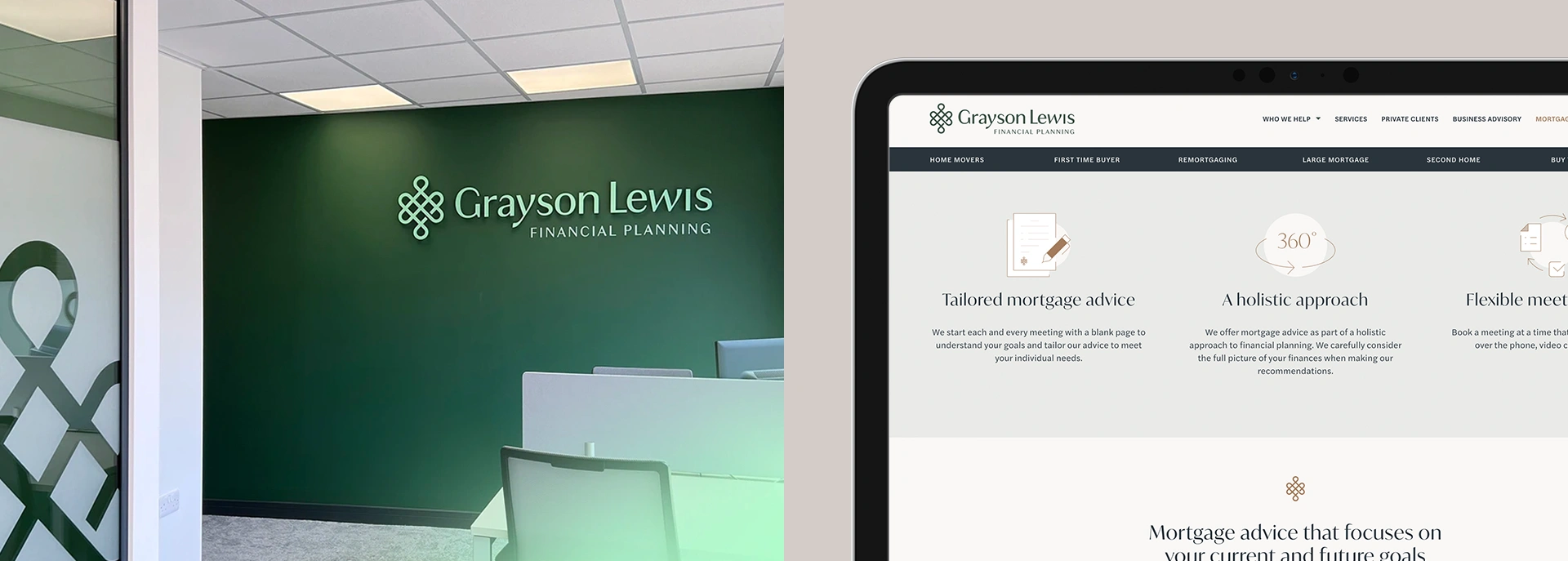
Grayson Lewis is a forward-thinking financial planning practice for aspirational individuals, families, and business owners. From retirement planning and specialist banking to mortgages and financial protection, they support people who take a proactive approach to financial planning.
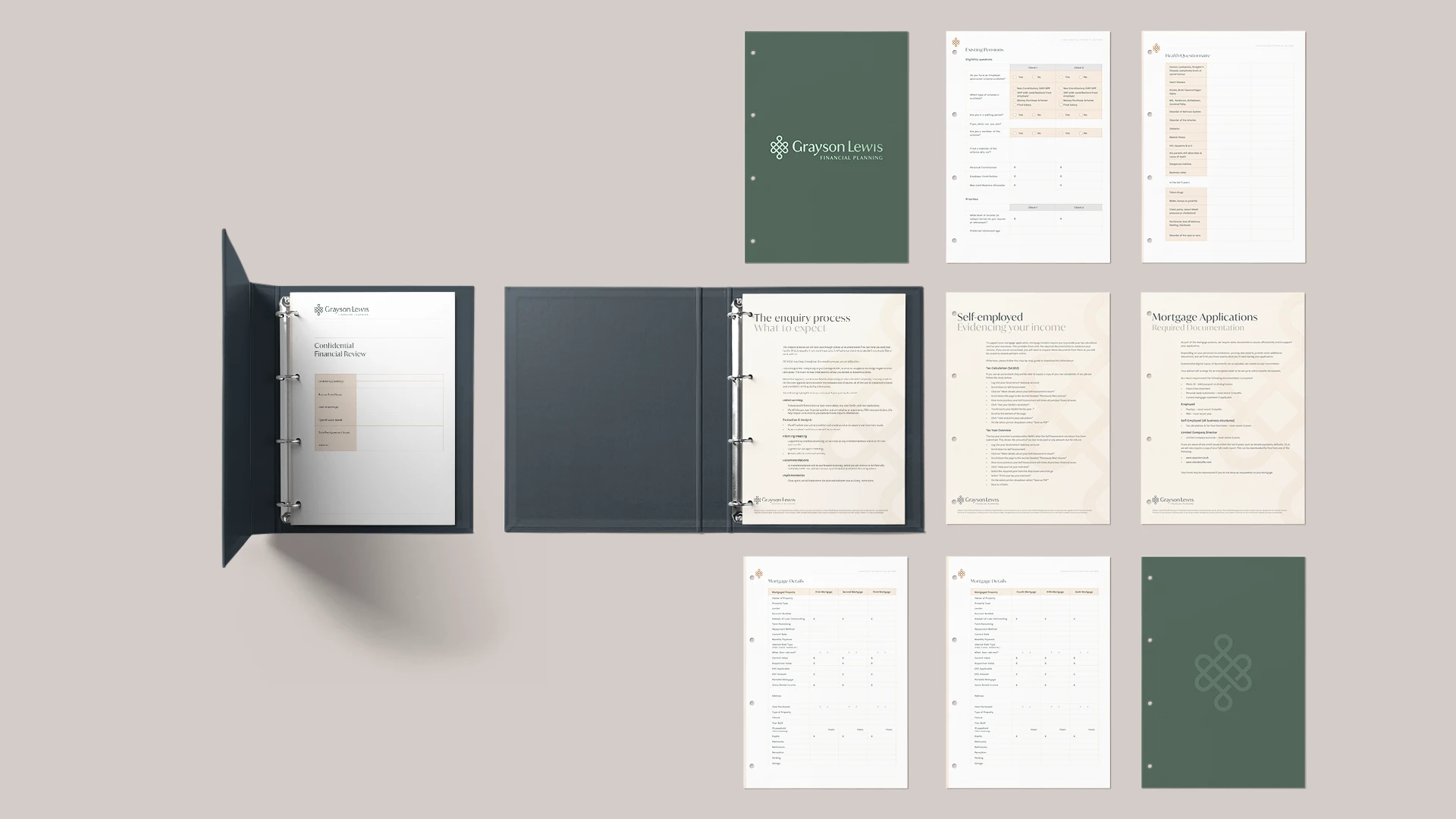
We were approached by founders Nick and Kirsty Henbrey to develop a brand identity for Grayson Lewis, as well as supporting marketing assets such as a new website, promotional brochure, corporate stationery and client documents.
A refreshing alternative to more traditional, rural financial practices
When thinking about Grayson Lewis as a brand, we wanted to reflect Nick and Kirsty’s ambitions for the firm, taking a non-traditional route in what is typically a very conservative and bland industry. How can we make Grayson Lewis warm and engaging? How can we position Grayson Lewis as a very different financial planning firm to other wealth management practices? How can we develop a brand that would resonate with people from all walks of life, who might consider that financial advice isn’t for them?

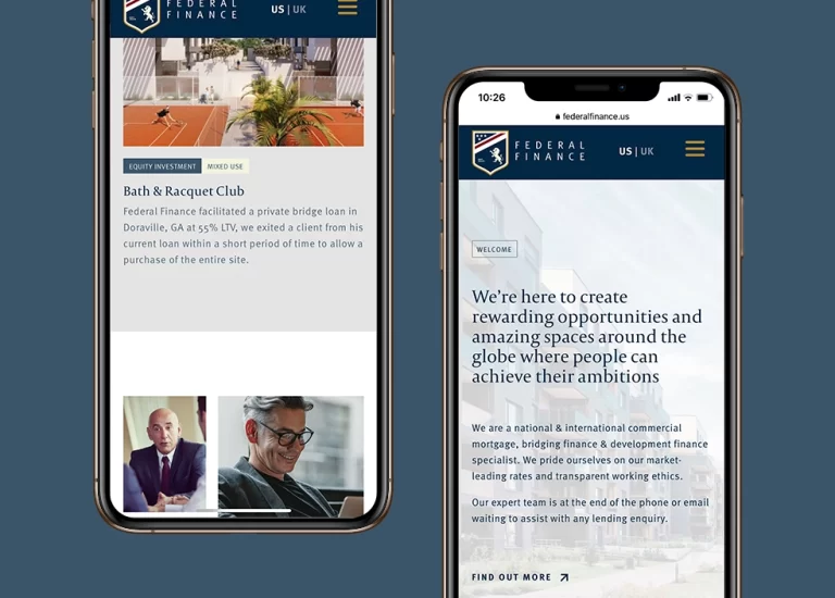
Our unrivalled experience in the creation and reinvention of professional service firms – BHW, Federal Finance, Aura and Juno Sports Tax – was a key reason for Creative Direction being chosen to partner with Grayson Lewis.
As well as launching a new brand and website for Grayson Lewis, we also created a promotional brochure, iconography, corporate folder and supporting client documents.
Reflecting their long-term and unified approach to financial planning
Offering a subtle tribute to Nick’s naval history as a submariner, an iconic knot became the perfect foundation to start telling the Grayson Lewis story.
The Grayson Lewis knot symbolises their long-term and unified approach to financial planning; an eternal and active role in their client’s financial future, and the intertwining of generations connected by a family. Importantly, it’s a symbol of security and protection.

I could not recommend Creative Direction highly enough. Initially I approached them to assist with developing my branding and logo for my new business. They listened to the goals and vision of the business and created something I thought was completely in line with the brief. Since then we have worked on a number of projects and I have been delighted with every one
NICK HENBREY DIRECTOR
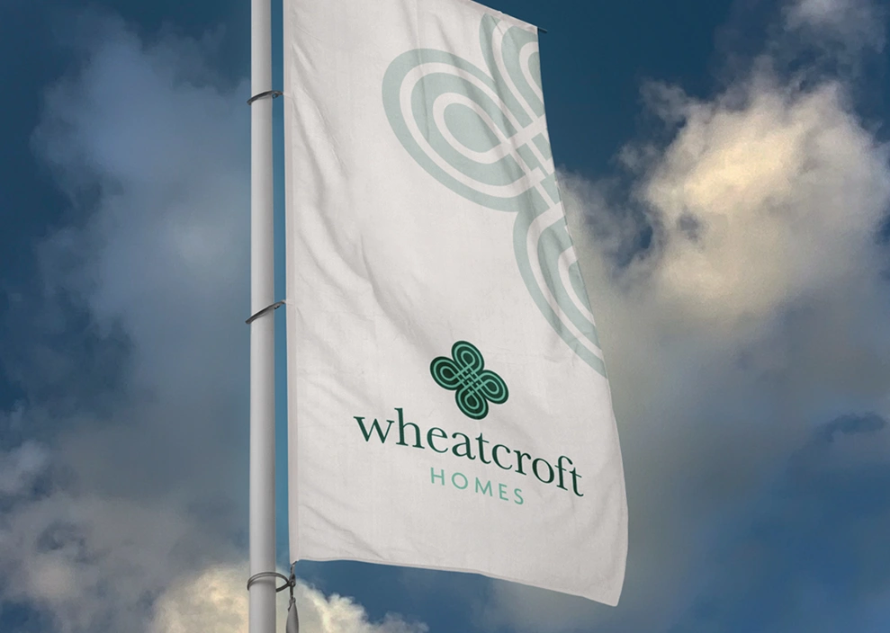
Take a peek at some of our other work