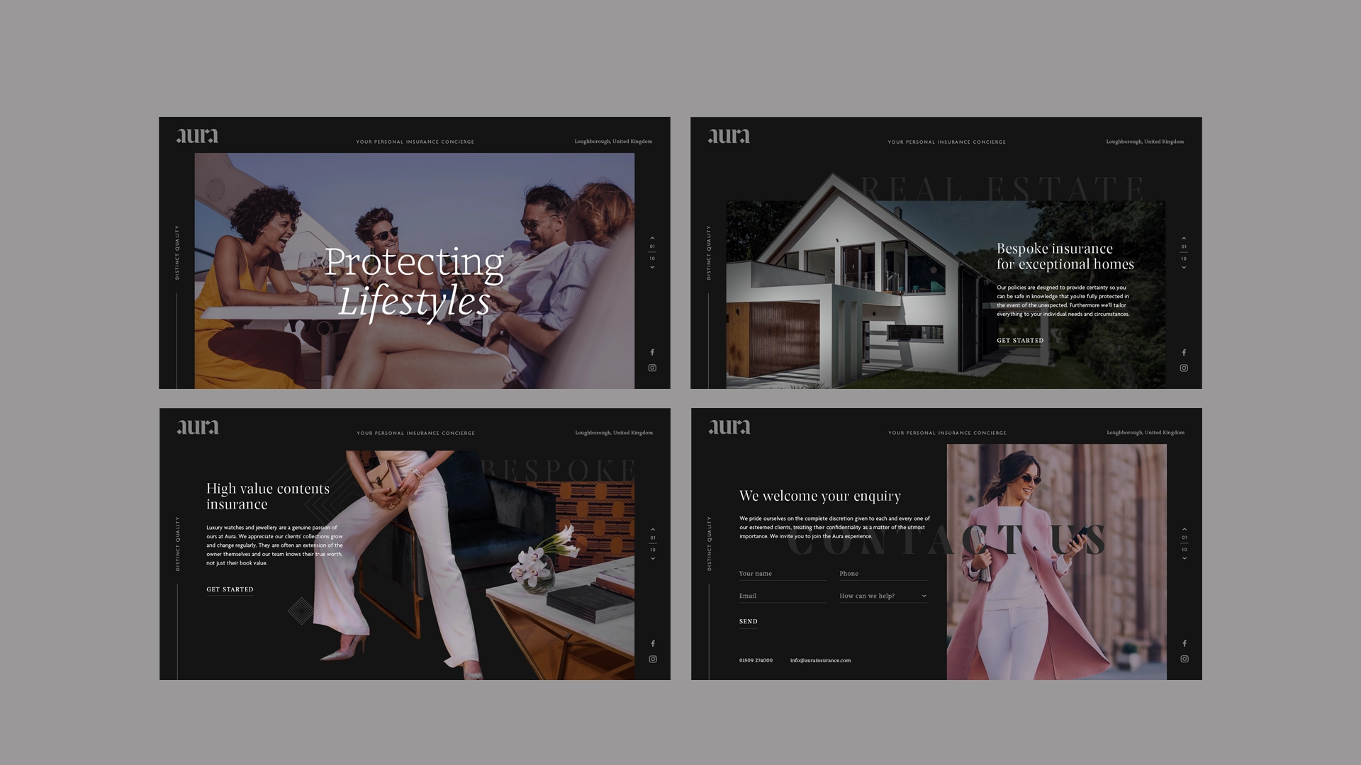
Aura Insurance
insurancebyaura.comProject Services
Defining distinct quality for new personal insurance brand
Aura is one of several new specialist brands to be launched in the last year by Anthony James Insurance Group. We created both a brand strategy, brand name and visual identity for Aura, positioning it as a personal insurance concierge serving affluent individuals and protecting life’s luxuries across the globe.
In Aura, we landed on a great brand name to start developing a proposition. By its very definition, Aura is the distinct quality that seems to surround or be generated by a person or place. The real creative challenge was: how can we create an identity which reflects affluence and luxurious lifestyles, and yet equally appeal to people of different nationalities, backgrounds and cultures?
If Aura wanted to truly lead, it needed to abandon the design clichés which have become ever-present in luxury brands. After all, we were talking about clients that include Hollywood film directors, famous actors and captains of industry. Aura offers a service that protects some of the grandest properties in the world, as well as luxury yachts and £800,000 handbag collections. Any bland, sans-serif logotype simply wasn’t going to cut it.
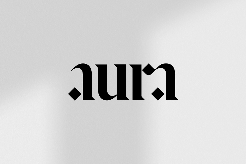
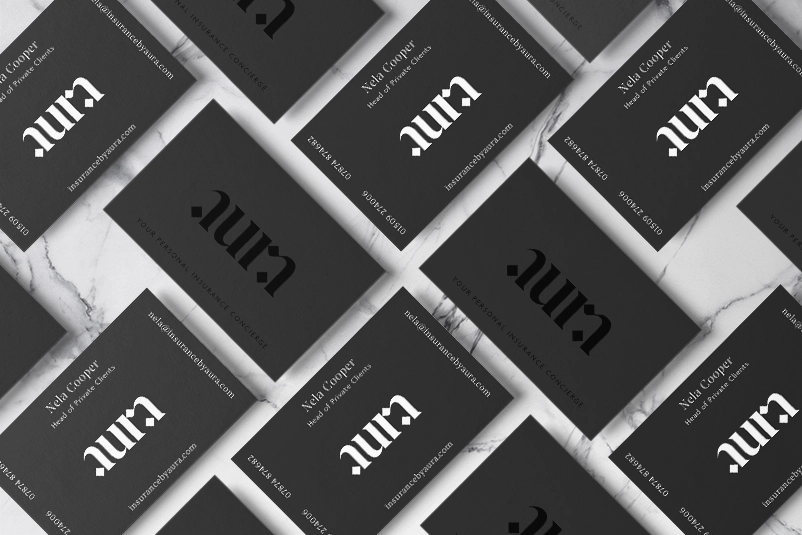
A unique logotype
The identity for Aura brings together the strengths of several typographic explorations. Referencing a Gothic Blackletter typeface, the identity feels steeped in history and yet bold, eye-catching and contemporary. The ligature between the ‘R’ and ‘A’, the diamond shapes and crisp serifs draw inspiration from Arabic type, giving the brand an international appeal. Most importantly, it feels more like symbol of quality than a typographic logo to be easily read.
This quite literally adds an aura of mystery; only to be truly understood if you’re astute, discerning and an Aura client.
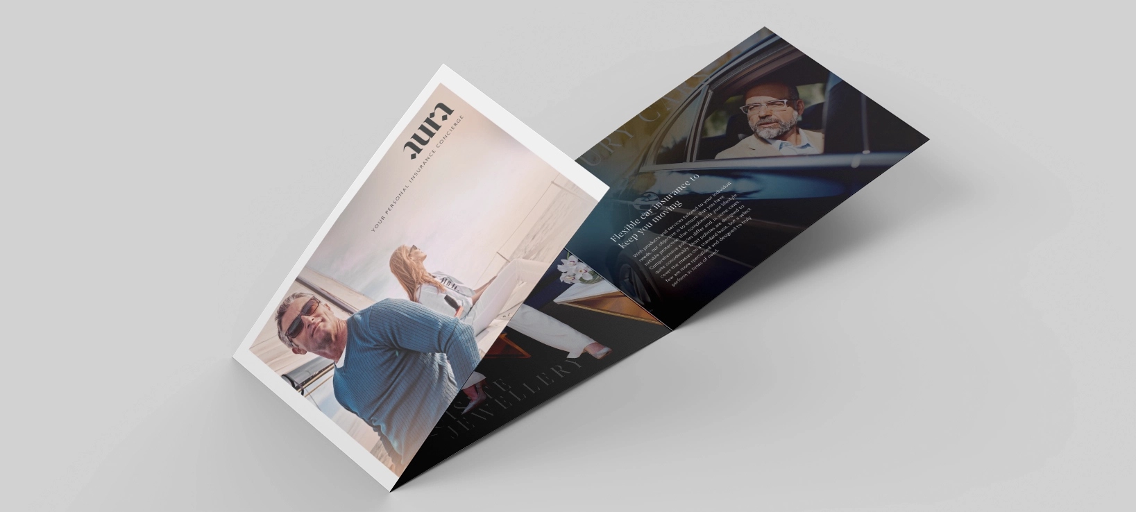
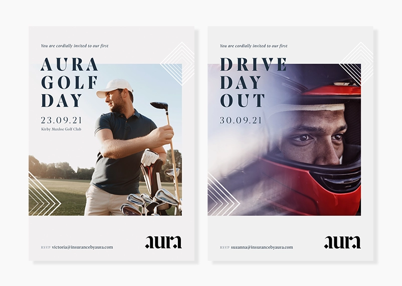

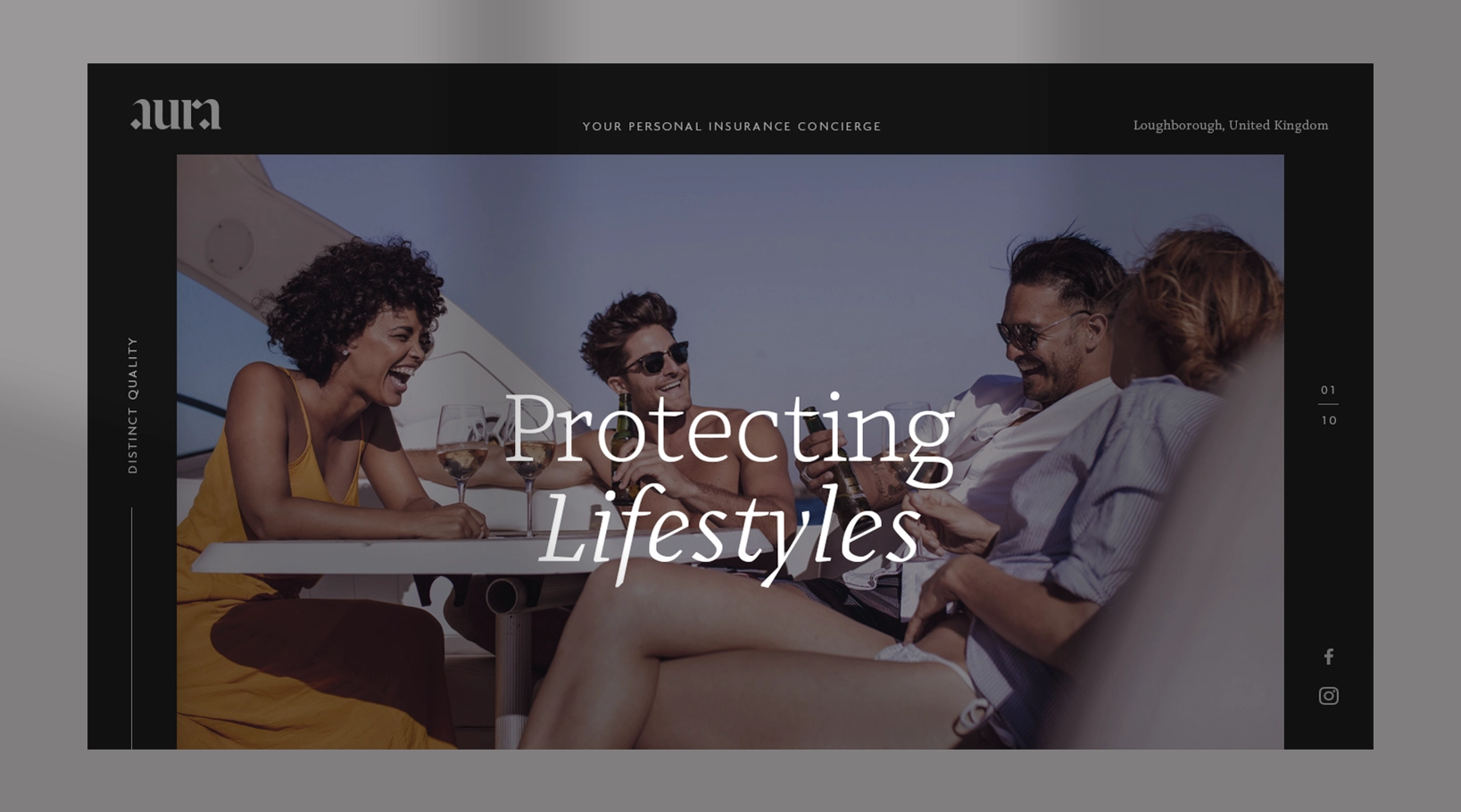
There are several brand assets that make up the Aura brand identity. Working to a tight budget, photography has been carefully selected from available image libraries. However, in order for Aura to ‘own’ these images, we’ve cut out areas and added colour highlights and lo-lights to add a sense of dynamism and drama.
A recognisably crisp, contemporary serif typeface, with optical sizes is a key component of the brand. It feels historic and calligraphic, with some eye-catching angular features that really compliment the logo identity.
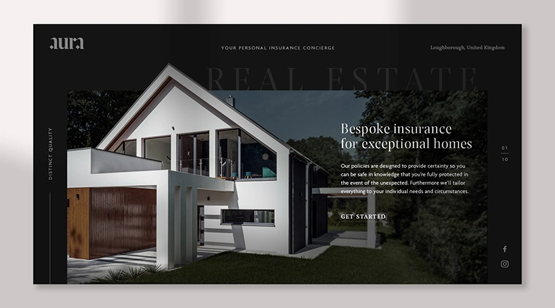
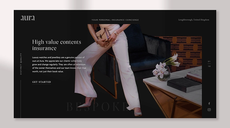
We also developed a series of diamond-shaped symbols of with line weights that fluctuate to visually surround photography, headlines and copy.
Working across a variety of brand experience aspects; print and marketing communications, social and digital, we ensured the highest standards were achieved across every touchpoint.