The FIFA World Cup is arguably the most anticipated sporting event in the world and the pinnacle tournament for football.
It is often forgotten that aside from an event itself, the World Cup holds a branding success story of phenomenal proportions. With Qatar 2022 kicking off at the weekend, we thought it was the perfect time to reflect on past World Cup branding and logos.
A brief history of marketing World Cup tournaments
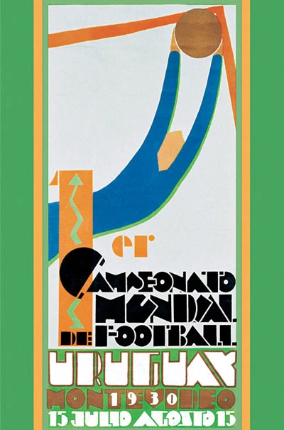
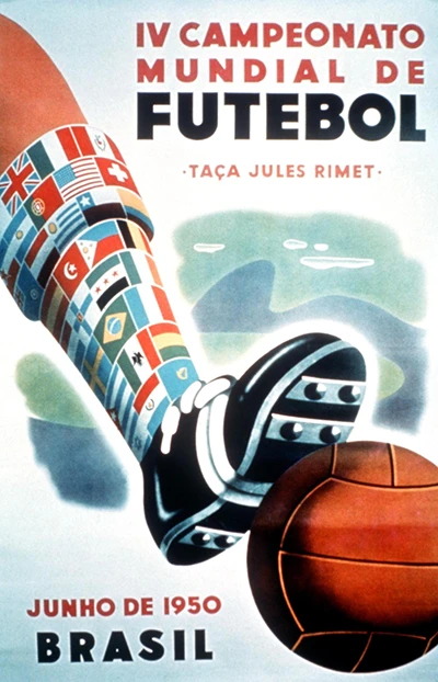
The first four World Cups from 1930–1950, the host countries would use illustrative posters to promote the events. At this point, there was no official logo identity meaning there was a lot of creative freedom.
Between 1954–1966, the host countries had complete control over their tournaments visual identity and how this was portrayed to audiences.
After the 1970 tournament, FIFA began to take more control over the marketing and adopted a brand identity for World Cups. The host country was still involved, and since then the design process has been a joint project, usually involving FIFA in-house designers and other exterior agencies of the host country.
World Cup branding: from illustrative to brand consistency
Hosting the World Cup enables countries to educate a wider audience on their culture and what characteristics they hold, but in more recent logos this is only subtly conveyed.
The posters for the World Cups between 1930-1966 were the most expressive, usually depicting players, some cultural aspects of the host nation, as well as the colours of the participating countries flag. This was supported with text – usually translating to ‘World Football Championships’ – in the native language of the country.
The 1970 World Cup in Mexico marks a dramatic shift in approach, with an official logo identity developed for each tournament. It’s the first truly stripped-down logo, which includes an abstract football – a graphic device which will be used for future tournaments.
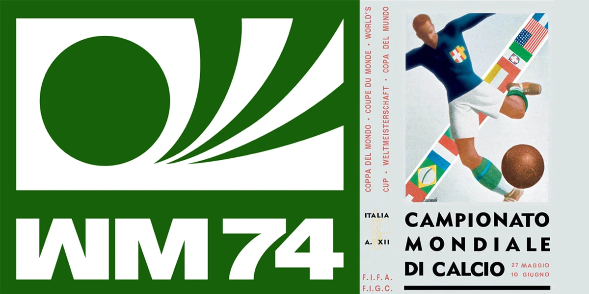
The absence of culture is sustained in the 1974 German World Cup, a logo in single colour too. Nothing suggested Germany as the host country aside from the letters WM which is an abbreviation for ‘Weltmeisterschaft’ translating to World Cup.
The same simplicity is shown in the 1978 Argentina logo. However, designers begin to adopt the colours of the host nation’s flag. From España 82 to France 1998, this design technique became a consistent asset.
The 1994 USA World Cup was the most heavily attended World Cup in history with a spectator count of almost 3.6 million. After Italia 1990, it marked the start of English only logotypes. Discarding the native language of the hosting country from the logo completely takes away the key cultural link to the host country.
In 2014, FIFA created new regulations and standards for the World Cup logo. Any future logos must include an abstract interpretation of the trophy somewhere within its design.
Though this does not directly eliminate any cultural references, it does perhaps limit creativity. However, this decision does keep brand consistency and demonstrates the evolution from the World Cup being culturally centric to delivering the same identity and values every time, despite the location.
Portraying the design trends of the time
When revisiting the logos and comparing them to the years they were created, the design mimics the trends of the time fairly well. Pre-1970 the visuals were more pictorial than graphic which allowed them to adopt traditional logo stereotypes. They were illustrative and clearly displayed the country’s characteristics allowing the audience to truly understand the origin of the hosting country.
The Switzerland 1954 World Cup logo was way ahead of its time, already trialing a minimalistic approach. With this design technique still being new, for the following World Cup Sweden decided to backtrack to a poster style logo, albeit with some liberties. The 1958 logo still pays homage to simplistic design but sticks within the comfort zone of previously successful visuals. Minimalistic designs were continued for many World Cups to follow.
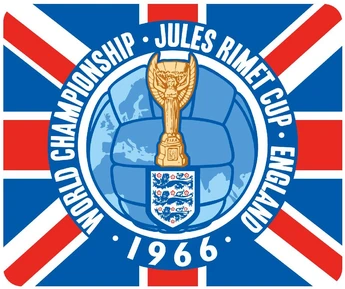
England 1966 was the first World Cup logo to feature the trophy within the design. It was also the most quintessentially British logo possible with the union jack and three lions taking pride of place. It was the only logo to feature the Jules Rimet cup before its redesign in 1974. The trophy remains the same to this day and is the design that must be included in every logo.
The 2002 Korea/Japan World Cup logo was described as more ‘with the times’ following the turn of the millennium. Instead of including a graphic football and the colours of the host nation, the logo included a depiction of the trophy.
It was thought to be one of the most strategically designed World Cup logos to date as it was built according to the artistic traditions and principles of both countries – harmony, asymmetry and dynamism. From 2002 onwards the trophy design plays a cameo in all FIFA World Cup logos despite not being made a compulsory element until 2014.
Brazil 2014 was the first World Cup logo designed with kinetics in mind. Kinetics conceptually extends the logo to consider movement, it brings the brand to life through motion.
The visuals for the World Cup were no longer just logos, but a range of different advertising media. Designing with kinetics allowed the logo to keep up with changing times and ultimately captured the design trends of the millennium. This logo paved the way, and all have followed suit since.
A breakdown of the Qatar 2022 World Cup: culture vs design
The Qatar 2022 World Cup logo has received mixed reviews in the media even causing controversy in the design world.
The logo doesn’t take the regular stance of the trophy but instead a vague adaptation of it. The figure 8 is to represent the eight different stadiums that the games will be played in, it is also meant to be depicted as an infinity sign to emphasise the unity and human connections that will last long after the tournament.
The logo has also been designed with the traditional clothing, such as shawls in mind. Shawls are commonly worn in the winter months by people across the Middle East. With the tournament taking place during the winter months, it’s a direct link to the cultural traditions of the country. The decorative floral patterns also mimic those embroidered onto shawls and are an important element of Qatar’s heritage and reflect the richness of Middle Eastern culture.
The use of Arabic calligraphy is evident in this logotype. The extended line between the letters ‘t’ and ‘a’ in Qatar is known as a Kasheeda and is a common characteristic of Arabic calligraphy. Similarly to this, diacritics have been added as a design feature on the logo but are commonly placed above and below letters in traditional Arabic dialect.