Barrie Stephen Beauty
barriestephenhair.co.ukProject Services
Re-establishing Leicester’s premier hairdressing group
Barrie Stephen is one of the country’s most talented and prominent hairdressers, establishing a group of highly respected, multi-award winning salons throughout Leicestershire.
Inspired by 25 years of hairdressing excellence, we were challenged with developing the next chapter for Barrie Stephen. A refined logotype, an entirely reconsidered design system and new website were all developed to inspire internal teams, prospective clients and even other hairdressers to be part of this fresh direction.
Creating cutting-edge: a brand with new highlights
The Barrie Stephen Hair Salon Group has grown to become a brand synonymous with quality and a recognised creative force within the hairdressing industry. However, this wasn’t being reflected across any of their touchpoints. Most notably, their website had become a sea of beige with poor typography, whilst failing to index in Google for the most obvious keywords and phrases.
We started by refining, the Barrie Stephen brand for more coherence across all areas of communication, introducing a new colour palette, brand typefaces and tone of voice.
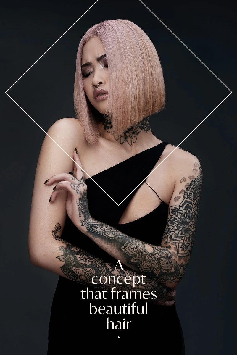
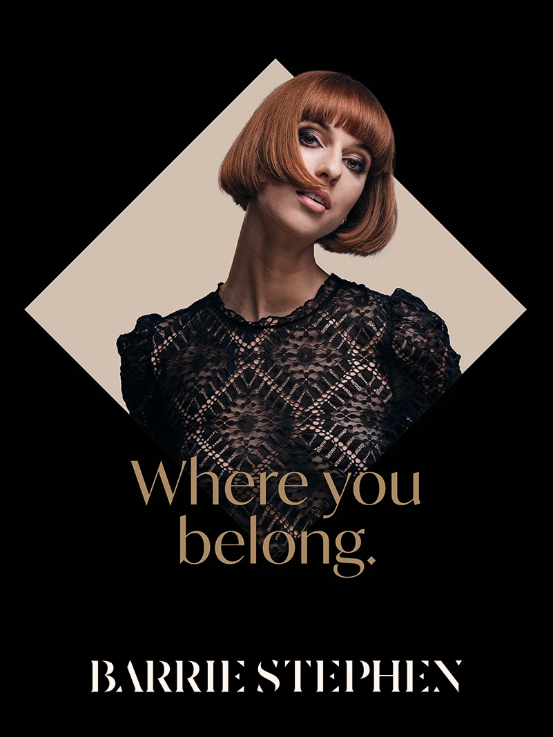
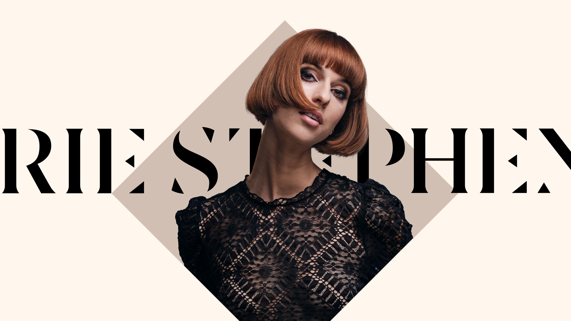
A striking fresh look
At the heart of a refreshed visual system and drawing inspiration from the Barrie Stephen logotype is a powerfully simple diamond silhouette we can use to tell inspired stories.
Whether used for promotional posters, on Instagram, A boards or online, the consistent graphic language gives Barrie Stephen a strong voice to connect with people across Leicestershire and holds up a mirror into the world of Barrie Stephen.

A colour palette taken directly from the world of hair, fashion and beauty
The Barrie Stephen brand has always been restricted by its lack of a defined colour palette.
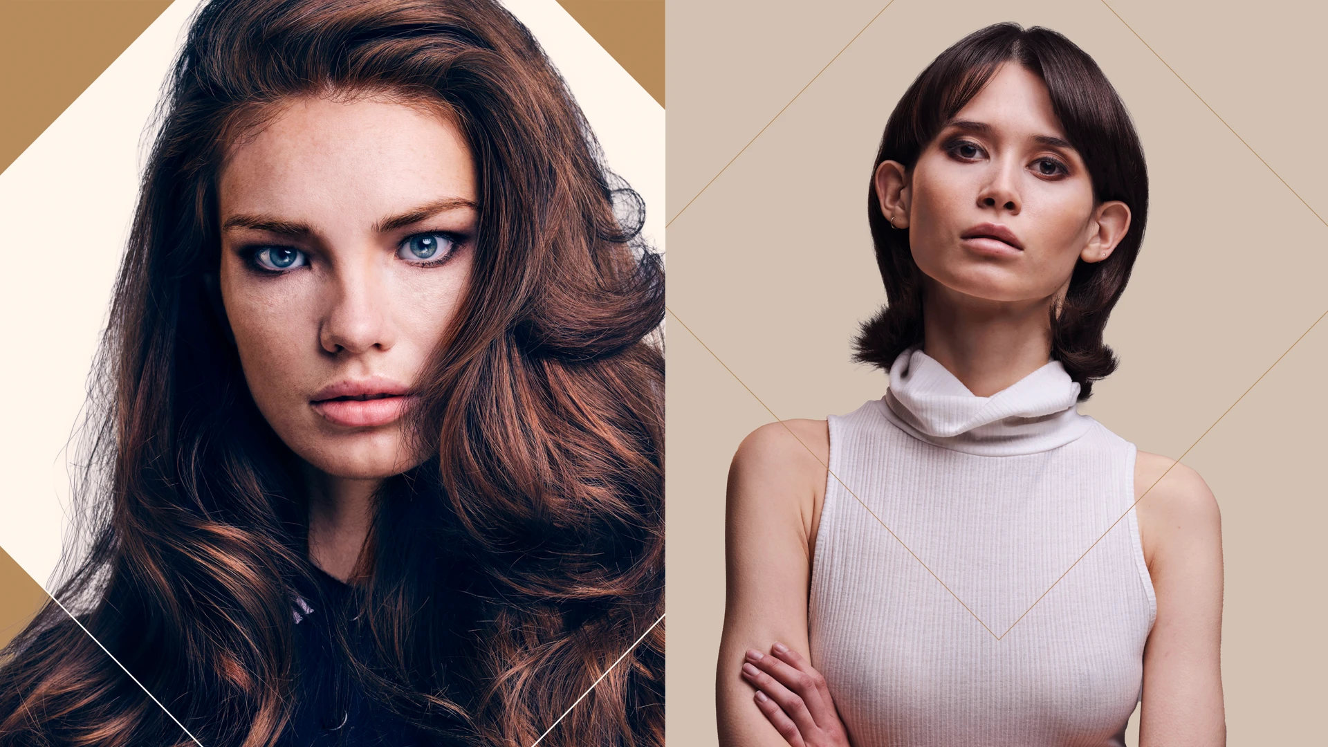
Black and white is fine, but an enriched range of colours allows the Barrie Stephen brand to flex to match its context; giving the brand the ability to shout or whisper, whilst still being authentic and aspirational.
The colour palette has been curated directly from Barrie Stephen’s world of hair, fashion and beauty to appeal to a discerning audience. This sophisticated range of colours naturally compliments fashion photography, allowing us to be brave with colour and lead, whilst other salons stick to black, white and grey.
Distinct, highly editorial typography
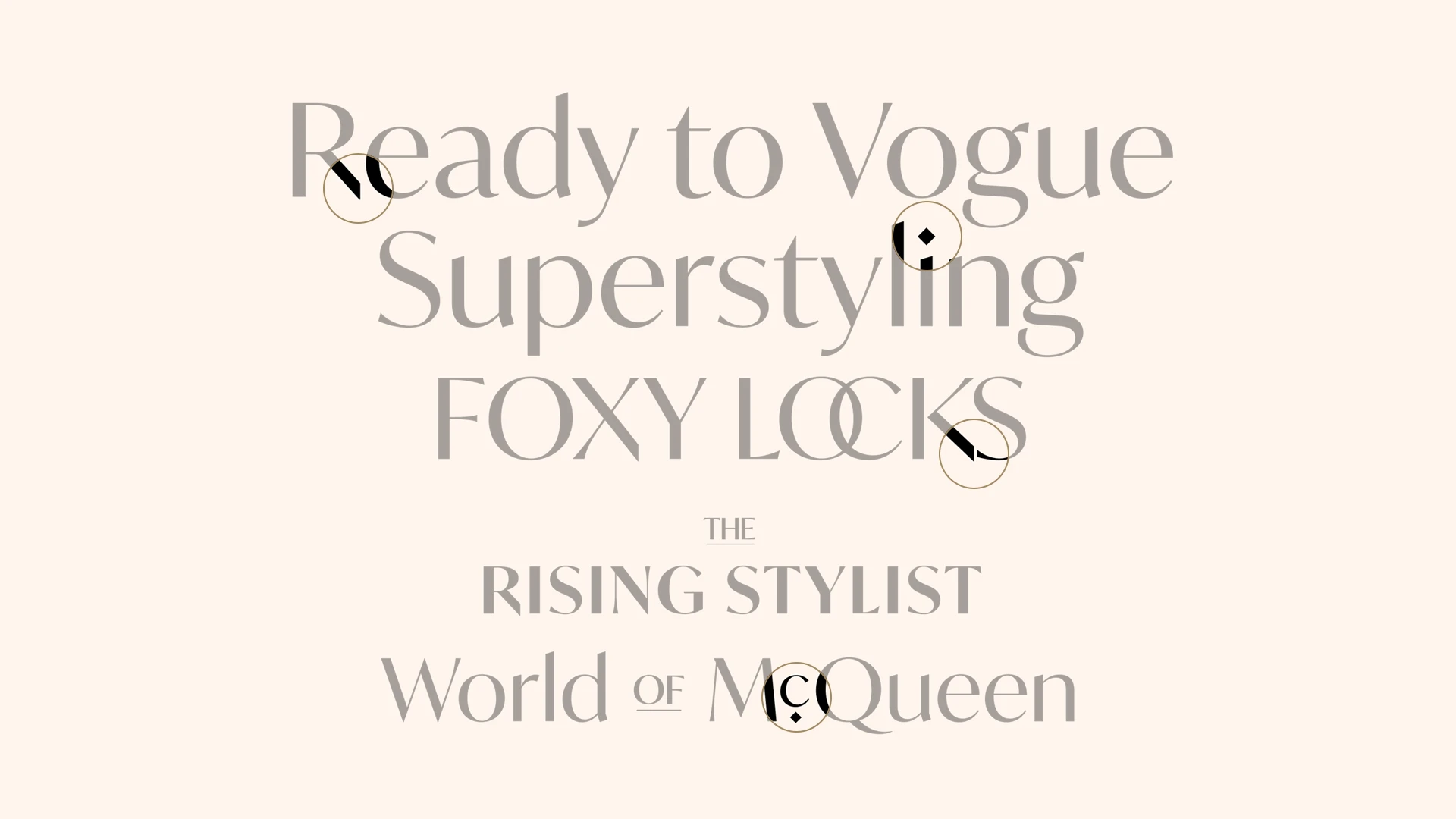
IvyMode is our dramatic contrast, highly editorial, modern yet minimal sans serif typeface allowing us to express the brand across various touchpoints.
It’s the perfect high-fashion match to the Barrie Stephen logotype, with cut diagonals on the R, X and K. It features an extended set of ligatures, stylistic alternates and diamond shaped dots for a wide range of typographic treatments.
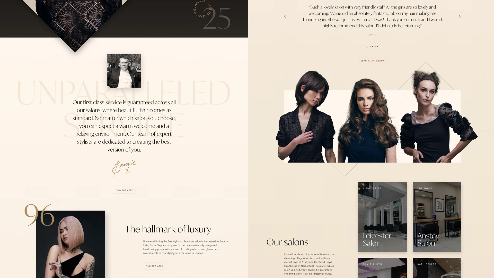
Web design that emulates some of the very best lifestyle brands
We approached the design with the single requirement; it must stand out from the competition. We started the process by experimenting with unique layouts, finding new and interesting ways to display their content whilst bringing their brand assets to life, digitally. Visually, the website needed to instantly inspire trust to endear itself to lifestyle conscious consumers.
We introduced a Hair Trends feature linked to members of the team, introducing them and their style, so prospective clients can almost buy hairstyles off the shelf.
We set the foundation with the correct keywords, search terms and phrases for which future PR and SEO campaigns can be built around.
My business website has been updated and refreshed a number of times over the years. It is often quite a long and difficult process to get right. Working with Creative Direction has really been a breath of fresh air.
BARRIE STEPHEN
The results
Besides the new website being well received by suppliers and existing clients, within the first week of launch, we achieved page one Google ranking positions for their most integral key phrases, such as ‘Hairdresser Leicester’ and ‘Hairdressers Leicester’.

