Our Expertise
Packaging Design
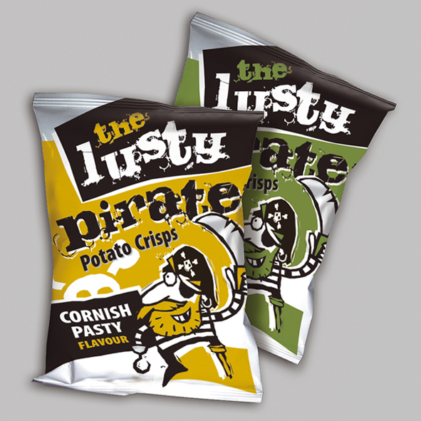
We have a proven track record of developing highly original, commercial and award winning packaging solutions for products as varied as fresh milk, beer, crisps and biscuits.
Mere decoration has never been a substitute for a good idea. That idea must be underscored by a marketing strategy, research, competitor analysis and an agreed and realistic product positioning in order to create a compelling narrative. Our packaging designs are distinctive, recognisable and look delicious – most importantly, they are successful.
The proof is in the pudding. We’ve helped brands to achieve product listings in all the major supermarkets as well as luxury department stores. Listings are all well and good, but irrelevant if packaging doesn’t whet the appetite of consumers. Some of our packaging success stories have been audited and we have seen dramatically increased sales.
Furniss
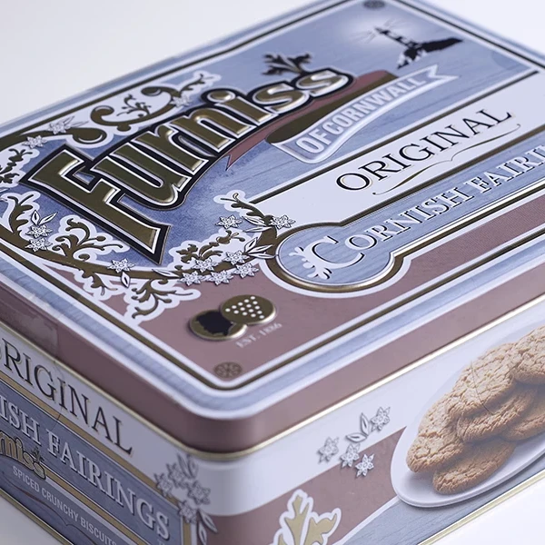
Furniss has been crafting quality biscuits and Fairings in Cornwall since 1886, using perfected recipes and quality locally sourced ingredients. Driven by the history of John Copper Furniss, the biscuit manufacturer is the only company in the world licensed to make The Original Cornish Fairing.
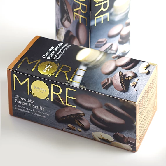
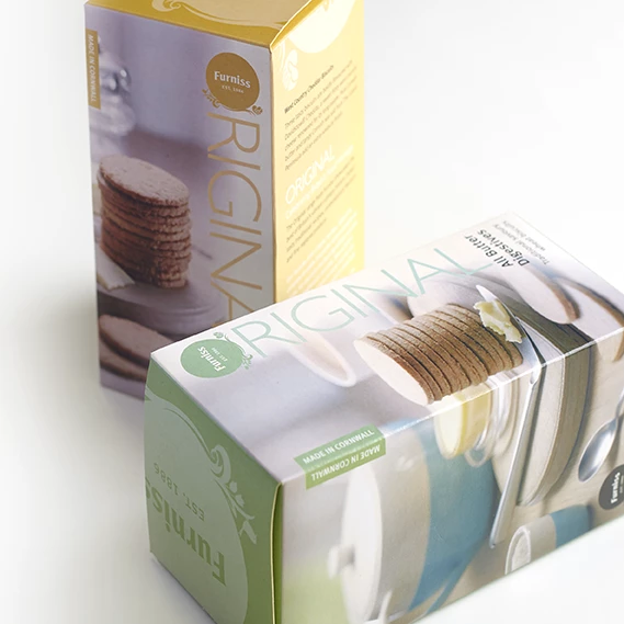
Furniss has trusted Creative Direction on a number of packaging projects, helping take them out of the holiday and gifting market to achieve shelf space within the major multiples such as Tesco and Sainsbury’s, as well as Harvey Nichols. As part of these product redesigns, we art directed photography to enhance the quality of the ingredients and provide flavour cues. For their More range, we gave their core visual assets a premium and artisan twist by using dark slate backdrops within the food photography and gold foil touches.
To celebrate Furniss’ centenary, Creative Direction were charged with the design of a selection tin. Inspired by their Cornish heritage, the packaging design was developed around a tin one might find in grandad’s shed or workshop used to keep nuts, bolts and washers.
This award winning solution used Victorian inspired typographic treatments and vintage decorative illustrations to bring this packaging concept to life.
Newlands
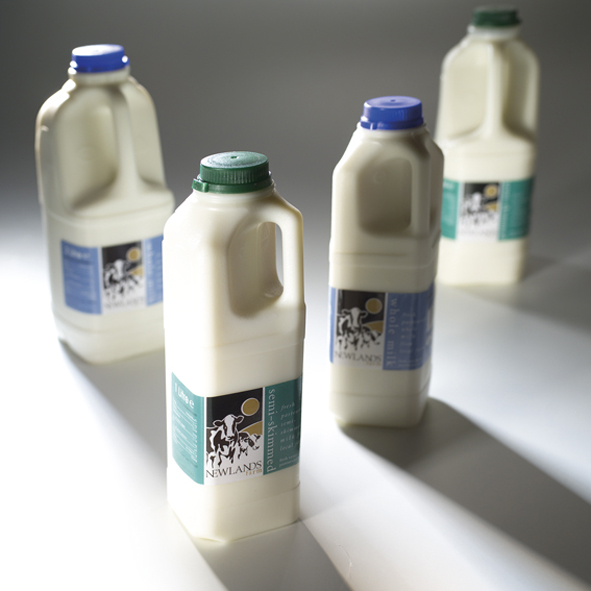
Newlands had already achieved a listing in Tesco, but were looking to redesign their milk packaging. We developed a simple, but effective new labelling system that used darker, richer reds, blues and greens for skimmed, semi-skimmed and full fat milk, rather than the saturated colours you typically associate with milk packaging and labelling.
This new look resulted in audited figures showing a 30% increase in sales as well as a listing within Asda. Subsequently, Newlands were purchased by Müller in less than two years.
St Austell Brewery
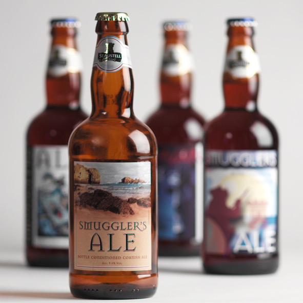
St Austell Brewery entered a competition along with 100 other breweries to win the opportunity to gain a full time listing for their beers across Asda supermarkets. Following a blind taste test, six beers were chosen to compete against each other on shelf appeal alone. We deliberately abandoned beer packaging clichés such as reds, blacks and foils.
The designs focus on the provenance of the beers with dreamy, romantic Cornish beach scenes that would conjure fond holiday memories. The result: our range of Smuggler’s Ales sold 10 beers to every one of the competition’s.
